I built this dashboard because I wanted to actually see the data behind the work I want to do. Chronic disease population analytics is at the center of value-based care, care gap programs, and health system strategy — and I'm targeting roles in Detroit and Chicago that do exactly this. So I went to the source: the CDC PLACES 2025 dataset, 14,790 county-level records, and built a Power BI dashboard that shows where chronic disease burden is highest, what Michigan looks like specifically, and how it compares to the rest of the country.
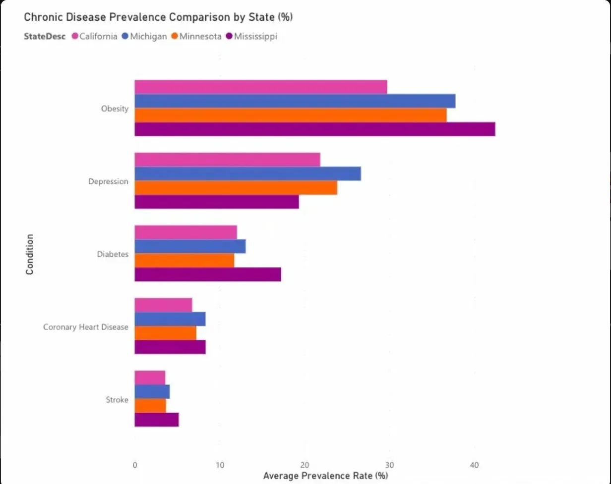
Michigan has the highest depression rate among the 4 states compared; Mississippi leads in obesity and diabetes
Why This Work Matters
Chronic disease is the defining challenge of modern healthcare. It drives the majority of hospitalizations, it's the primary target of value-based care contracts, and it's what population health teams spend their careers trying to move the needle on. Understanding where burden is highest — not just nationally, but at the state and county level — is exactly the kind of analysis that informs care gap identification, outreach prioritization, and prevention investment.
Michigan specifically matters to me. I'm building a career focused on Detroit-area health systems, and knowing that Michigan's depression rate sits at 26.67% — the highest among the states I compared — isn't just a data point. It's a signal about where integrated behavioral health programs are most needed, and where I'd want to contribute.
What I Built
I used Python and pandas to pull the CDC PLACES 2025 dataset, filter it to 14,790 county-level rows, and isolate crude prevalence estimates for five conditions: diabetes, obesity, coronary heart disease, stroke, and depression. Then I loaded the cleaned data into Power BI and built four views:
- Four Michigan metric cards — county-averaged rates for each condition, giving an at-a-glance statewide picture
- A ranked bar chart of diabetes prevalence across all 50 states, so you can immediately see where the outliers sit
- A side-by-side state comparison — California, Michigan, Minnesota, and Mississippi — across all five conditions to show the range of regional variation
Michigan at a Glance
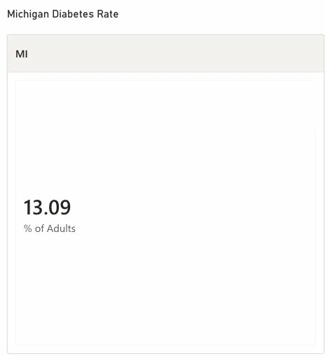
Michigan diabetes rate: 13.09% of adults
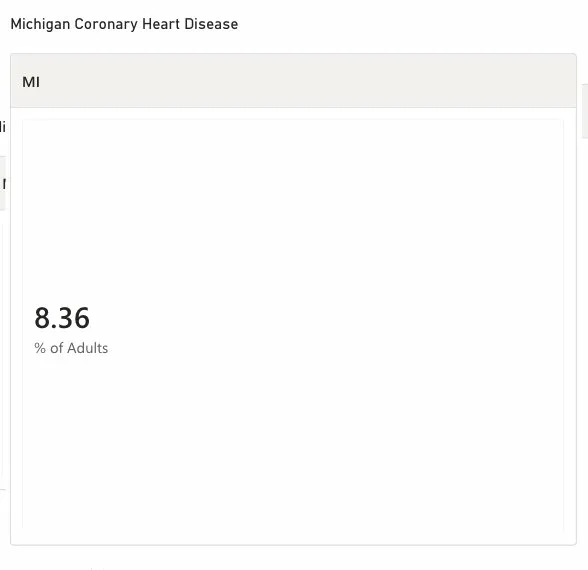
Michigan coronary heart disease rate: 8.36% of adults
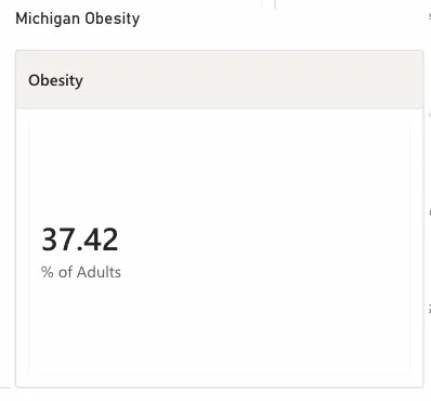
Michigan obesity rate: 37.42% of adults
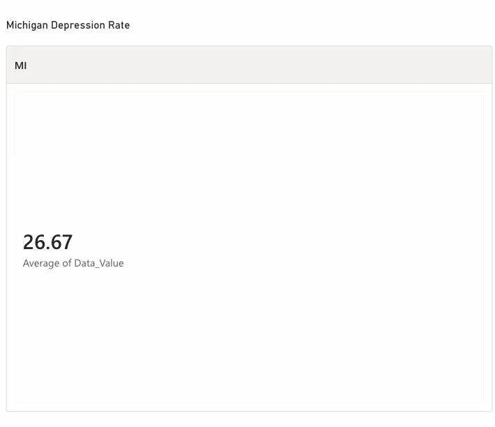
Michigan depression rate: 26.67% of adults
The National Picture — Diabetes Across 50 States
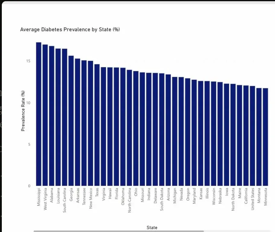
Diabetes prevalence ranked across all 50 states — Mississippi highest at 17.2%, Minnesota lowest at 11.5%
What the Data Actually Shows
A few things jumped out that I think are worth naming directly:
The Southeast carries a disproportionate burden. Mississippi's diabetes rate is nearly 50% higher than Minnesota's — that's not a marginal difference, it's a different public health reality. When I see this in a care gap program context, it means very different intervention strategies.
Michigan's depression rate is a standout. At 26.67%, it's the highest among the four states I compared. For a health system in Detroit, this is a direct argument for integrated behavioral health — not as a nice-to-have, but as a core clinical strategy.
Obesity is running 2–3x higher than diabetes in every state. That gap represents the upstream prevention opportunity — the space between where people are now and where chronic disease sets in. It's where outreach and lifestyle programs live.
California's consistently lower rates are worth investigating. Whether it's driven by lifestyle, policy, access, or demographics, understanding that story is part of what makes comparative population analytics valuable — not just describing differences, but explaining them.
Where I'd Take This Next
The obvious next step is connecting chronic disease prevalence to social determinants — income, insurance coverage, food access, housing stability. The CDC PLACES dataset pairs well with SDOH data, and I'd want to build a regression layer that starts to explain the variation rather than just measure it.
I'd also want to drill down to the county level for Michigan specifically — not just state averages, but identifying the highest-need communities for targeted care outreach. That's the analysis that actually moves resources.